Early this century I joined an art tour to the Northern Territory where we spent time sketching and painting in Kakadu and Nitmiluk National Parks at sites like Ubirr Rock, Katherine Gorge and at Anbangbang Billabong near Nourlangi Rock.
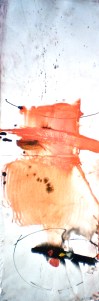
I produced, among others, two images one about Anbangbang Billabong and the other about Ubirr Rock on Fabriano print paper as it readily absorbed diluted indian ink and damp grated pastel and water plus a little gesso as I depicted part of the dried billabong quickly before the moist surface dried in the heat.
A collector bought the two originals. With permission I put their files into ‘Sketchbook’ and made a few alterations digitally from which several smaller prints of the digital images were made and printed onto Hanhlemehule printmaking paper in keeping with the originals. A small problem was that although I liked the colour before printing, later I wasn’t as happy as the colour seemed too bright. So I left them for a while and returned to oil painting.

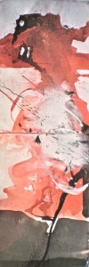
But the November sales of printmaking, handmade and rice papers in Fitzroy turned out to be a paper fest. – so hard to go past so many wonderful surfaces, textures, semi-transparencies and muted colours all completely filling my plan drawers. An affinity between the drawer in which these gorgeous papers lay and the drawer below in which the reproduced prints lay sparked in my mind. I imagined the strongly coloured prints placed behind the recently purchased semi-transparent papers and thought that there could be an interesting juxtaposition between not quite literal format of the printed images and the wabi sabi effect of rice paper etc. So I got to it – the evolution of an image.


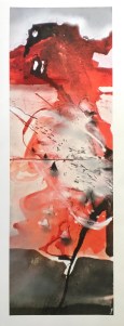
In the last image of the first composition titled Memory at Anbangbang Billabong, 2016 little remains visible of imagery beneath, having completely covered any reference to the landform in the background top section of the composition. The black and mauve shape echoes the original but is back to front. Beneath the semi trans-parent sheet of paper with an ink stain provided a surface into which I carved out short lines with a scalpel alluding to the lines in the original that indicated the presence of a dried flood plain minus its billabong having evaporated by scorching sun in a cloudless sky so characteristic of the dry season in northern Australia.
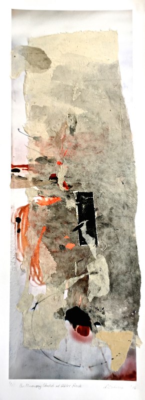
In Preliminary Sketch at Ubirr Rock, 2016 an ink washed piece of rice paper became the first layer into which I carved different shapes again revealing glimpses of the print beneath. The simplicity provided by the textured and slightly tonally graded rice paper alluded to rocky texture with out being too literal. Once again less was more.

Just returned from Kardinia Framers where the buyer made a good choice with a plain wooden frame.

Hi Elaine,
I thoroughly enjoyed reading the insight into how the artwork evolves,transforms and comes alive. As for Preliminary Sketch of Ubirr Rock I have found the perfect place on the wall where it is admired everyday.
Thank you so much. Nat
LikeLike
Very gratifying for it to be included in your collection.
LikeLike